Instead of selecting a color of the year from its wide library of shades, Pantone created an entirely new hue for 2022, a first in the 23-year history of the program. The vibrant, warm and joyful shade of periwinkle is designed to pique curiosity and creativity, and symbolise our transition out of the isolation of the COVID-19 pandemic.

Says Leatrice Eiseman, Executive Director for the Pantone Color Institute, “Encompassing the qualities of the blues, yet at the same time possessing a violet-red undertone, Very Peri encourages courageous creativity and imaginative expression. Very Peri displays a spritely, joyous attitude and dynamic presence that encourages courageous creativity and imaginative expressions.“

We are living in transformative times, and Very Peri is a symbol of the global zeitgeist. A sense of a new ‘normal’ is evolving as new physical and digital dynamics merge in innovative ways.

Whether introduced to interiors through furniture, accent pieces or paint colors, Very Peri imparts an imaginative, hopeful attitude to any space. In fact this shade has been embraced globally by furniture designers, fashion houses, interior designers and product developers alike.
The Pantone Color of the Year selection process requires a thoughtful consideration and trend analysis of new colours. From streetwear to haute couture, from music, art and film to cultural influences, lifestyle and playstyles, colour captures worldwide attention and affects our day to day lives in multi-faceted ways.

Adds Laurie Pressman, Vice President of the Pantone Color Institute. “Creating a new color for the first time in the history of our Pantone Color of the Year educational color program reflects the global innovation and transformation taking place. As society continues to recognize color as a critical form of communication, and a way to express and affect ideas and emotions and engage and connect, the complexity of this new red violet infused blue hue highlights the expansive possibilities that lay before us.”
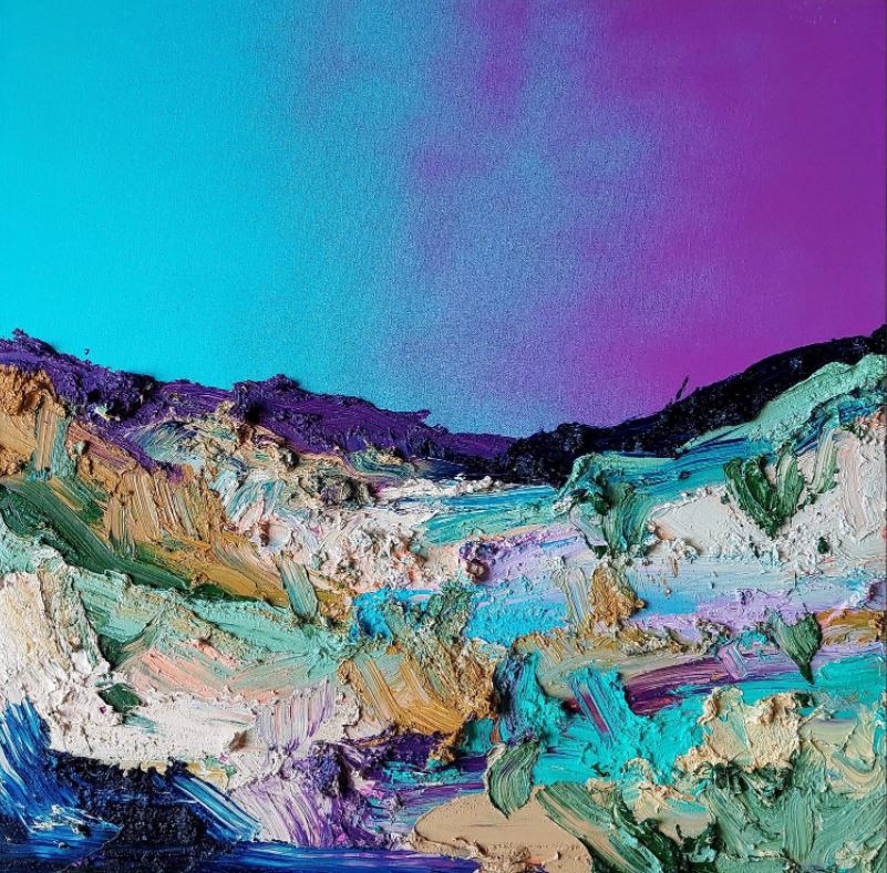
A versatile shade, the violet red undertone of Very Peri has a spritely attitude, the blue notes have a calming effect and the lilac tones represent wellness, relaxation and meditation.

Very Peri has already been gracing red carpets and cat walks. Lady Gaga wore a stunning Gucci dress at the House Of Gucci premiere in London, and Camila Cabello and Anya Taylor-Joy have also debuted the colour at prestigious A-list events. When it comes to high fashion, we’ve seen the Very Peri hue has taken centre stage in a variety of current collections including Valentino and Tracy Chu.

And the shade has been translated using a variety to hues for bed linen, soft furnishings, prints, bags and shoes.


From left: Bedthreads Lilac 100% French Flax Linen Bedding Set – $230 / The Attico patent leather pumps – $1,115 / Bottega Veneta Mini Twist bag – $1,720 / Tickled Pink Art Cushion from Greenhouse Interiors – $119
Whilst this colour is not for the faint-hearted as a whole room colour palette, introduction of the shade with vases, candles, soft furnishings and artwork make Very Peri very workable. Mixing the tone with other shades can create a striking yet soothing look.
Decorator items we love right now:


Clockwise from top left: De La Luz Stripe Lagoon from Ralph Lauren Home / Urban Atelier Indigo Gloss Tile from National Tiles – $0.95 each / Betty Chairs from vorsen.com.au – $199 / Purple Maze by Marinka Parnham from Greenhouse Interiors – $1,100.00 / 3181 Candle – $ 80 and Wisteria Quartz Coffee Table from Fenton & Fenton $ 2,800 / Kip & Co Kantha Lila Bedspread – $349 / Studio EO Drill Vases from Simone Haag
Are you looking for colour advice for your home, or a custom design solution without the bespoke designer fee? KWD Access has been created just for you. We have developed three very special consultation packages to help make your design dream a reality. Three super affordable options for one-on-one design advice that will set you in the right direction: https://kwdandco.com.au/kwd-access.html