


Colour predictions are a designer’s dream. It’s not about blindly following trends or creating short term design solutions, it is important to understand what colours are forecast for the coming year so that we offer the best possible advice for our clients.
When it comes to hard finish solutions, our focus is not on soft furnishings and decorative pieces which are easily interchangeable and replaceable seasonally (or as particular trends come and go). Hard finishes are there for the long haul, and they are a considerable investment. They are an emotional as well as a functional choice and have to be fit for purpose and work well with the space. Texture and tone play an important part, and this where colour trends come into play.


We do work (a lot) with paint colours, carpets, rugs and wallpapers, and here’s where we can really have some fun with colour. It of course depends on the style of home and the adventurous nature of the client, but paint in particular is an economical way to explore colour choices and add a sense of whimsy to a home. Paint is definitely the easiest way to add colour or change a mood, quickly and economically.


So we play close attention to the key colour predictors. Pantone is the world’s colour aficionado, and when they release their colour palettes for the year ahead, we always ensure we keep these in mind when creating briefs for our clients. And it seems that 2018 is looking bright!
At the recent International Home + Housewares Show, the Pantone Colour Institute’s Executive Director Leatrice Eiseman, gave a sneak peak into what colour and design trends we can expect to see in 2018.


While Pantone’s 2017 colour of the year – Greenery – is still the shade on everyone’s mind, have a look at Pantone’s eight colour palette’s for some new year design inspiration.
Playful:
This playful palette is not really meant to be taken (too) seriously with bright, fun colours like ‘Minion Yellow’ (kids pop culture influencing mainstream design?) and ‘Lime Popsicle’ bringing a cheeky, bold element to children’s rooms and perhaps kitchens and bathrooms.


You can’t help but smile at these clean, fresh shades, but their use may be as highlights rather than whole rooms.

Discretion:
A juxtaposition set against the ‘Playful’ palette, ‘Discretion’ is all about subtle, at times de-saturated hues, with some brand new shades and a focus on the power of pink. A beautiful colour palette for living and resting areas of the home.

A palette of vegetal colours and healthy hues, celeries and berries and shades of egg blue. Bolder than ‘Discretion’ but still easy on the eye.


Far-fetched:
Warm and earthy tones create an eclectic mix of cultural influences, a nod to far flung lands. A palette that will work so well in Australian homes. We love a blend of tribal patterns and soft textures.

An interesting blend of warm and cool tones, there’s a balance of blue and oranges that kind of works, drawing the eye in and creating a new blend. Very new, very cool.

With pantone colours like ‘Brilliant White’ and ‘Frosted Almond’, this story is influenced by (or will it influence?) technology, balancing out bright pinks, turquoise and purple shades. An interesting story for tile choices, especially geometric mosaics.

Intricacy:
A palette of neutral metallics, less shine and more satin with some dramatic accents. The softer shine elements allow metallics to work without being brash or making too much of a statement. Velvets balance out copper, brass and muted gold.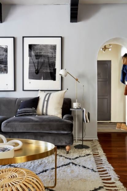

An eclectic mix of colour and tones that evoke a sense of strength, power and sophistication, all balanced out with highlights of black and gold. This is a gorgeous look for luxe bathrooms, kitchens and right throughout a home that wants a bolder, sophisticated look.

As for Dulux, their colour team has been forecasting colour trends for over 18 years, and have been working with all levels of design from mainstream residential to high end commercial and everything in between. So they know their stuff right? Their 2018 colour forecasts are all about creating balance with colour – physically and metaphysically. Colour can help to temper the complex challenges of every day life, and provides us with a tool for self expression through design.

“Balance is desired in many areas of life, whether it be work-life balance or a sense of inner balance,” explains Andrea Lecena-Orr (Dulux Colour & Communications Manager). “With the future of interiors in mind, the idea of balance is crucial to ensure we can live and work in harmonious spaces that help to stimulate our senses, as well as enable us to relax and retreat.”
For 2018, Dulux has created the four key themes:
Kinship:


The Kinship trend brings together a diverse mix of cultural references. We see a folklore revival, antique traditions, and Eastern influence and tribal cues. Furniture forms are inspired by traditional crafts such as wood turning, knitting and sewing and there is a colourful mish-mash of cultural influences that ignite a sense of community.


Essential:


Escapade:


REFLECT:
An opulent homage to the classics, Reflect revisits history’s best moments with an appreciation for the simple genius of classic architecture and design. Classic 30’s cues blend with bold 60’s style to create an ‘eclectic classic’ statement. Colour combinations are bold while furniture and furnishings channel a sense of timeless, understated luxury.


http://www.katewalkerdesign.com.au
Images courtesy of Dulux, Pantone, Ideal Home Magazine, Houzz, Brett Mickan Interior Design, Urban Outfitters, Consort Design, Becki Owens, Brady Tolbert and Brit & Co.
KWD images by Brent Lukey
https://www.consort-design.com/
https://www.urbanoutfitters.com/